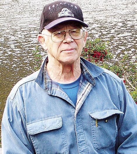
Moe Johnson Running with Moe
History of the Bobcat Prowl T-Shirts
I am helping the Retired Faculty and Staff at Texas State with the Bobcat Prowl 5K race on April 6th out at Country Estates. As part of a committee that meets for organizing the details of the race I have the privilege of seeing the design of the tee shirt and the awards. If you are a fan of the Texas State Bobcats you will appreciate this year’s design. The gold tee shirt has the image of the face of a Bobcat Painting by Bob Pankey. The awards are a very nice 3 inch medal with the Bobcat image on it. This medal would be a hit at any event for the Bobcats. It might be worth it to enter the race for the tee shirt and not even run or walk the race. Both the tee shirt and the awards impressed me.
The artwork for the Bobcat Prowl had me go back and look at some of my race shirts from over the years of putting on races. Many of my race shirts were designed by David Alexander and artists such as Jill Pankey and art students as well as a few shirts I designed. Some designs were provided by Cody at B.J’s. Tee Shirts with a little guidance from the race committee. Some of the designs were unique and looked good. Others were more for storing at the bottom of the race shirt pile in the closet. I drew a few that were more for a comic strip than a race shirt and a couple of the designs were okay.
A race shirt design is an important part of putting on a race. The sponsors have their logo on the back of the shirt and if the design is of good quality the runner will wear it often and the sponsor has the advertising advantage of being seen many times over. The quality of the shirt is also important if the runner is going to wear it outside of a race they are running in. The quality of fabric for race shirts has improved over the years. From a cheap cotton shirt to heavy duty cotton to a 50-50 cotton/ nylon to 100% high tech to a soft 100% high tech fabric and even a soft nonshrink cotton blend that is comfortable to wear have found their way to my race shirt collection. The type of shirt is also a factor to consider. Long sleeve versus short sleeve versus sleeveless. One year I gave a nylon runners jacket, instead of a tee shirt. It was a different offering from the tee shirt. The problem was I had to have a women’s jacket and a men’s jacket and runners won’t wear a jacket during the warm running months. I see a few of the jackets on occasion in the colder months at races.
The design has improved from a heavy non-breathable material to a breathable and colorful design. For the hot summer runs in Texas a large design that does not permit a flow of air through the fabric is not a favorite with runners. And the try at making the design smaller to prevent the buildup of heat from running makes the design hard to see and may not advertise the race. With the technology for designing images today the quality of a race image has reached new levels of improvement. With the new technology a design can be multi-colored and not increase the cost of the shirt. In the past every color added to the design cost $.50 or more. Race organizers looking at raising funds for their organization were more likely to go with a one or two color design for the shirt.
Looking over my stack of race shirts a few stand out as different from the standard design. One that was unique was the name of the race on a design of a “wanted/reward poster” complete with frayed edges and nail holes in the corners. Another design for the Country Roads 10K was the name of the race on a road sign with a few bullet holes and a deer logo on the bottom. One year the road sign was in the shape of the state of Texas and a bright yellow color like you see on highways. Adding a road under the sign was a plus for a design. One race for the American Heart Association had a sleeveless hooded tee shirt with a nice red heart on the left front of the shirt. The Capital 10K has the symbol of an armadillo in the logo. The design may be changed each year but somewhere in the logo was the armadillo. For my “Better Half Marathon” the logo for many of the races had a runner with a cowboy hat and ‘running boots’ as part of the design. There were a few where the head of the runner was a cowboy hat and the bottom of the head only. A few had ‘artistic’ shapes for the runner with curved limbs and other angular shapes. One had the runner coming toward the front of the shirt with the name and date of the race on the bottom of the shoe. If the design is unique and catches the eye of bystanders the chances are that the shirt was a success for both the race organizers and the sponsors of the race.


